It can be done, but not using the chartmakerplus extension. You will have to build your own html file with the chart requirements, and call the chart again with the new value.
@TIMAI2 - Thank you very much for your time, I will try directly with Google Line chart if I have problems, I will post some questions in the community.
@ABG - Please believe me that I read tons of documentation
that post - How do you use the chart2D plugin to create a chart with time as the horizontal axis - #3 by Kevinkun - I don't find it. Can be a good starting point. Thank you kindly @ABG for your guidance. My big problem is the fact that I'm not an engineering person trained (like you all), I'm a reverse-engineering trained person. I don't have your culture in the amount/diversity of things that I'll have at my disposition, I have 35+ years of research training on how other people think to make something.
Can be a weird/inappropriate approach to do something but must work. Until now it has worked without any help, from now I think that the power of distributed intelligence of people who spend their time to help can be a plus factor.
Another big thank you kindly for taking your time to illuminate me.
Best regards, Dan
You might get some ideas from here:
https://developers.google.com/chart/interactive/docs/gallery/gauge
I did a setup to make a replica tachometer and it worked well...
<html>
  <head>

<script type="text/javascript" src="https://www.gstatic.com/charts/loader.js"></script>
<script type="text/javascript">

google.charts.load('current', {'packages':['gauge']});
      google.charts.setOnLoadCallback(drawChart);

      function drawChart() {

        var data = google.visualization.arrayToDataTable([
          ['Label', 'Value'],
          ['RPM', 0],
        ]);

        var options = {
          width: 400, height: 400,
          redFrom: 55, redTo: 60,
          yellowFrom:60, yellowTo: 70,
          minorTicks: 5,
	  majorTicks: ["0",5,10,15,20,25,30,35,40,45,50,55,60,65,70],
	  max: 70,
	  animation: {duration:200},
        };

        var chart = new google.visualization.Gauge(document.getElementById('chart_div'));

        chart.draw(data, options);

        setInterval(function() {
	  if( window.AppInventor ){
          data.setValue(0,1,window.AppInventor.getWebViewString());
          } else {
	  data.setValue(0, 1, 0 + Math.round(60 * Math.random()));
	  }
	  chart.draw(data, options);
        }, 50);

      }
</script>
  </head>
  <body>
    <div id="chart_div" style="width: 400px; height: 400px;"></div>
  </body>
</html>
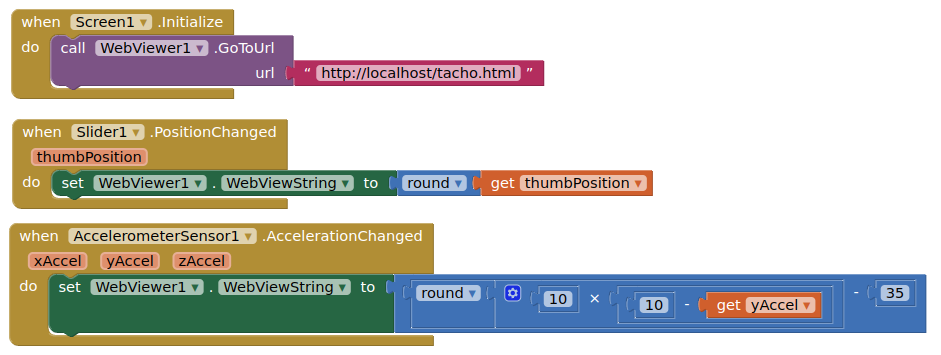
@TIMAI2 - The gauge I already use in my "complicated" program.
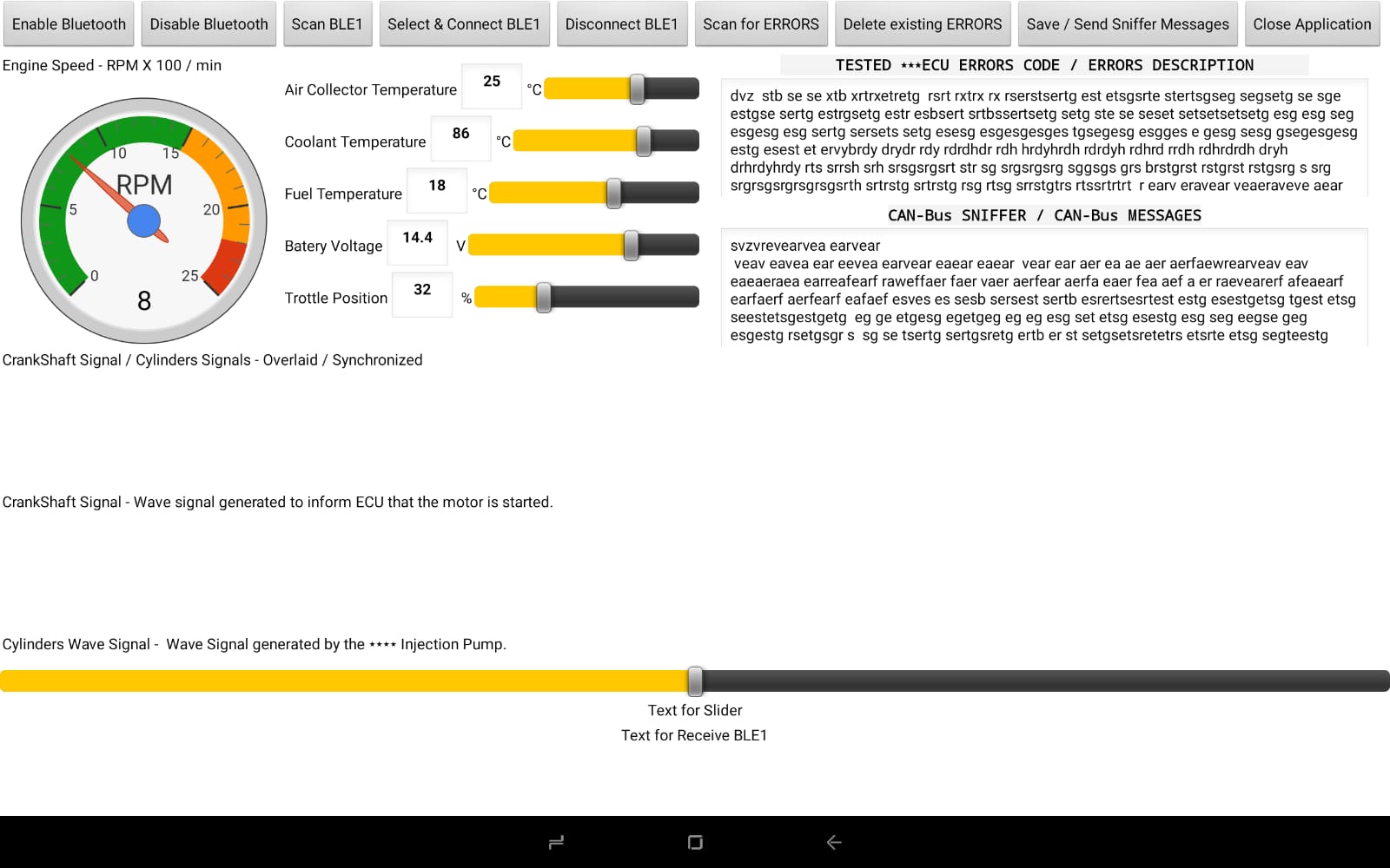
CrankShaft signal is controlled as RPM, number of teeth, missing teeth, and so on from MIT App Inventor.
One PWM signal - all controlled by MIT App Inventor.

Until now all that I need to communicate from MIT App Inventor to esp32 (it is an E series, in the future I will use an S3 - 32/8), but for now all it works fin 4-PWM, the crankshaft simulation generator, and so on. Now I'm in the fight with displaying some charts, after that will be the big fight with the CAN-bus that will be displayed where is the "dummy" text.
I discovered that the power that's behind MIT App Inventor / Google tools is impressive. A good old friend of mine has a 2023 year idea - to use MIT App Inventor to do some programs, not LabView with that I'll fight until now for my projects. Here https://www.youtube.com/watch?v=9zr9ctn501M - a humble example of a BGA Rework Station control software made in LabView.
Now I have started to port that application (BGA Rework Station control software) on MIT App Inventor.
Another huge thank you for your time spent to help me.
Best regards, Dan
1 Like
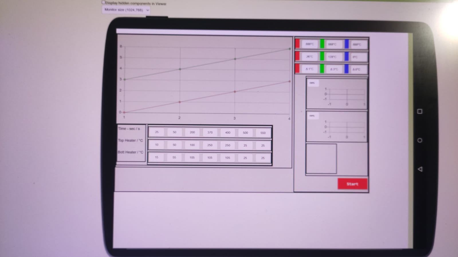
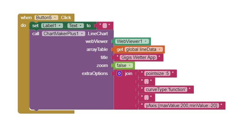
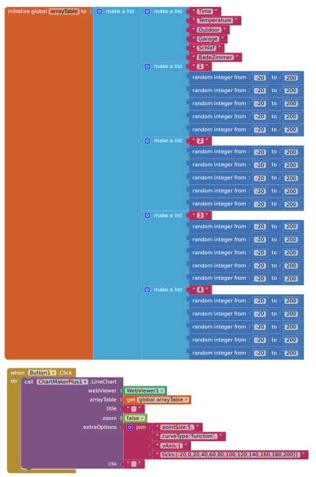
Chart Maker Plus
Since today I use ChatMakerPlus, a wonderful app .
My Problem my Numbers are between -10 and 100 but
the Graph Y Axis is from -200 to +200.
Can I adjust the Y Axis to -20 to 110
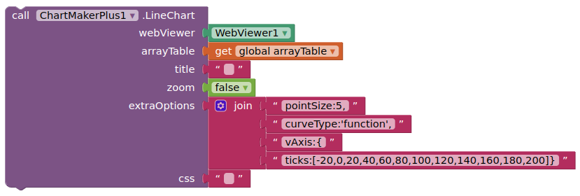
Yes, use the extraOptions socket to add options to your chart.
See the example blocks or configuration sections on Google Charts (all linked in first post of topic)
Like so:
![]()
Thx TIMAI12. I try Thx But it is not vAxis it is yAxis but anyway Thank you very much
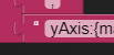
should be vAxis not yAxis
from the configuration options
Hello
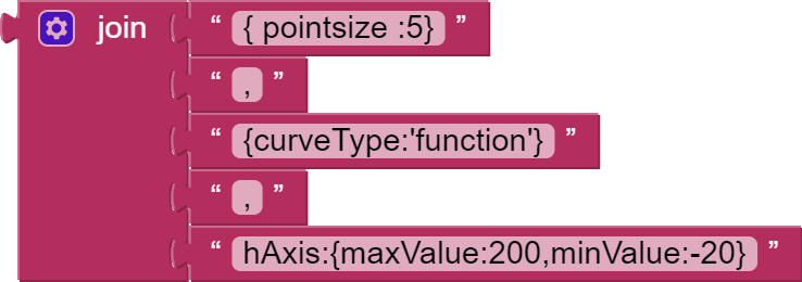
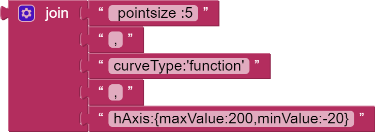
hAxis:{maxValue:200,minValue:-20} Works alone
But not the whole join Puzzle
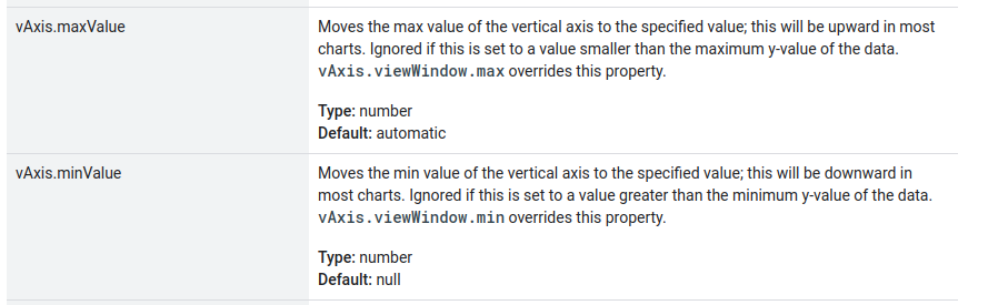
By the way where does I find a Guild with vAxis.maxValue Move the max....
Why did you add the curly brackets? These are only needed in you axis option
I found this to fiddle
But it seems that curveType:'function',
and maxValue are not working together.
Good morning guys
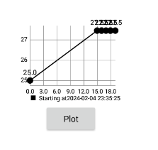
How can I use the graph in this Jason format that I receive from php mysql?
[{"date_time":"2024-02-04 23:35:25","s1":"25.00"},{"date_time":"2024-02-04 23:50:22","s1":"27.45"},{"date_time":"2024-02-04 23:51:06","s1":"27.45"},{"date_time":"2024-02-04 23:51:54","s1":"27.45"},{"date_time":"2024-02-04 23:52:28","s1":"27.45"},{"date_time":"2024-02-04 23:53:01","s1":"27.45"},{"date_time":"2024-02-04 23:53:17","s1":"27.45"},{"date_time":"2024-02-04 23:54:44","s1":"27.45"}]
Which graph do you want to display ?
Line chart
At x = date_time
At y = temperature
Here's one using the AI2 charts component, which does not treat JSON the way I had thought when starting out>
Screen2 has the working sample, Screen1 my failed JSON DataFile attempt.
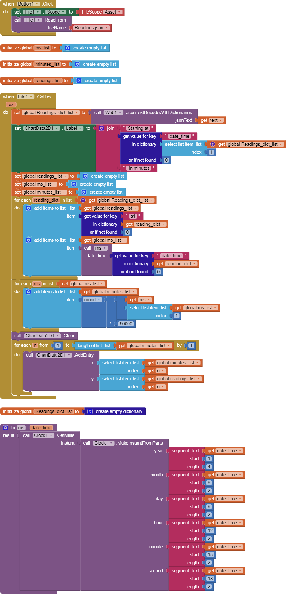
charts_JSON.aia (6.8 KB)
Most of the work is digesting the JSON and the timestamps.