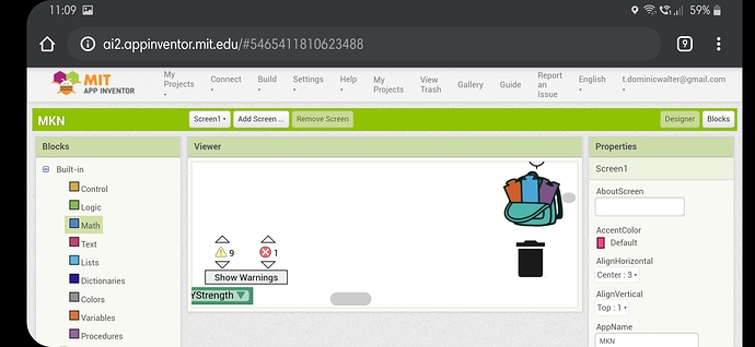
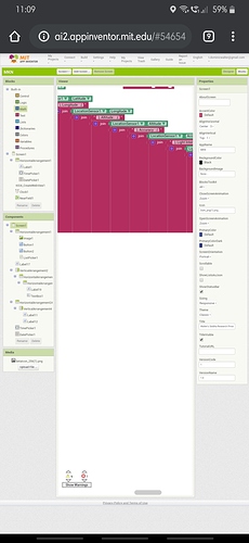
I got the same in a Desktop Browser so I tried the same in a Mobile Browser and there too I got the same in using it for a while...
What Browsers did you use Dominic? I think you can expect an awkward layout on a phone, they are not really suitable for the task. Interested to see your Desktop issue.
That deeply nested JOIN tree is probably driving the Blocks Editor nuts.
The fix here is to use the blue Mutator box on the outermost JOIN block to add the extra sockets to accommodate the rest of the text pieces you are stringing together, all in one block.
https://appinventor-mit-edu.ezproxy.canberra.edu.au/explore/ai2/support/concepts/mutators
1 Like
(Mutators added to FAQ)

