I have an app with a listpicker, when the listpicker loads on screen it looks very crowded, the gaps between the text items is about one character's height.
I added a new line to the end of every item to make the space between them look a little better but I then have to trim the selection if wanting to use it elsewhere.
It works fine as it is but thought there must be another or better way to add some "padding" between the listpicker elements. I checked all the available extensions for listpicker but couldnt see anything that would do it.
I think it could probably be done more efficiently, any suggestions ?
Give this extension a try
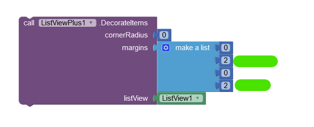
Use this block to specify how far apart you want it to be
Margins

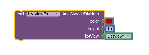
or dividers block

1 Like
@Boban Listpicker ?
The alternative to what you are doing @S11, is to generate a new list that adds spacings to each entry (e.g. \n), then to use the selection Index returned to pick the unmodified value from your original list.
Boban the ListViewPlus extension divider block does the required but only works for me if its transparent.
TIMAI2 thanks for the tip from a previous post "Background Transparent Colour = 16777215"