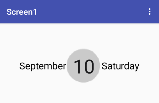
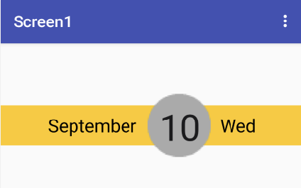
For example this way:

@Kevinkun, I have got to this level, the problem is, I want the outside arrangement (the lighter orange) to be shorter than the circle like this
How can I do that?
![]()
Anyway, I showed you both.
make one with a photo editor like photoshop.
No I need to know how to make the rectangle at the back be shorter than the circle. And I can’t figure out how to do that. It’s probably something like overlapping but how is that down??
You mean the background image❓

borrar_fondolabel.aia (4.4 KB)
Check if it works for you with a background image for different screen sizes.
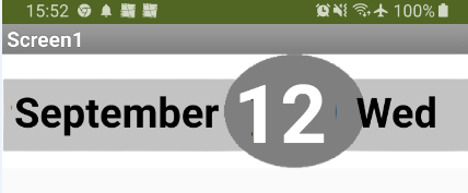
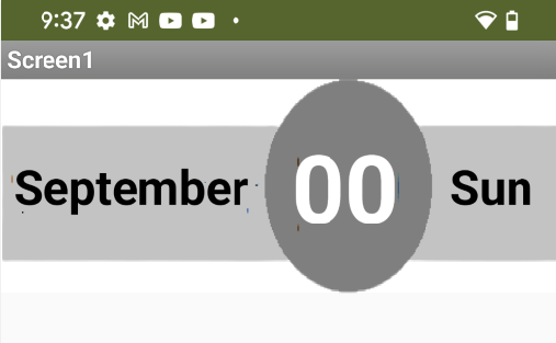
Yes, this will look different on different screen sizes:

This could work, but the circle needs to be dragged right? I want it to be fixed.
Sorry if there is an obvious answer, but I am rather a beginner
Perhaps by improving the width percentage of the labels and unchecking HasMargin you can get better centering.
borrar_fondolabel2.aia (4.5 KB)
Thanks I’ll check when I get my lap and let you know
Try this one (it should work on all Android versions / devices and also in Landscape / Portrait mode):
Check it on your test devices.
The screenshots are from a Pixel 4XL, Android 12:
Thanks, it works now!
Pixel 4XL (Android 12):

Ok thanks very much 
This is very smart!
This topic was automatically closed 7 days after the last reply. New replies are no longer allowed.