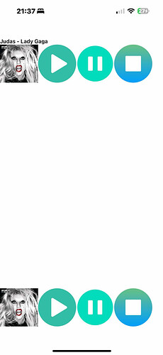
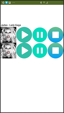
Good day to everyone, I am a student, and this bug prevented me from passing this activity. There is a large gap when connecting to the AI companion app, I double-checked if there is a misplaced component, but there is not. I tried creating a new account, switching phones, and using another computer, but sadly it still happens. Any help would be appreciated. Thanks.
upload your aia here, some power user will have a look.
[mod edit - link removed due to copyrighted material]
Alternative with mp3s removed, but does still contain images.
tiktoksoundsssss.aia (471.7 KB)
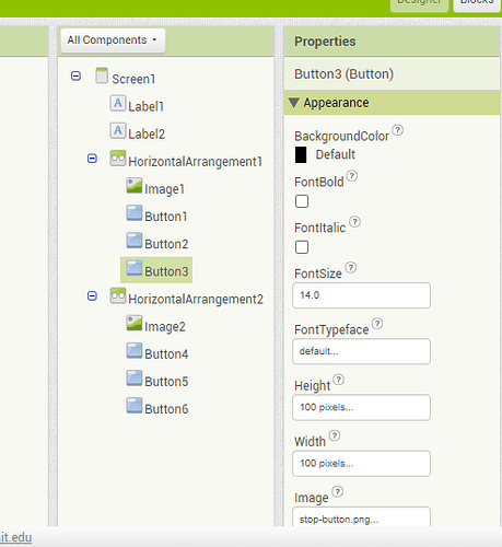
You hard coded pixel counts for button Height and Width across each of those Horizontal Arrangements.
That violates Responsive Design, which requires proportional sizing across all devices.
What ABG is basically saying is it is best to size components in percentages.
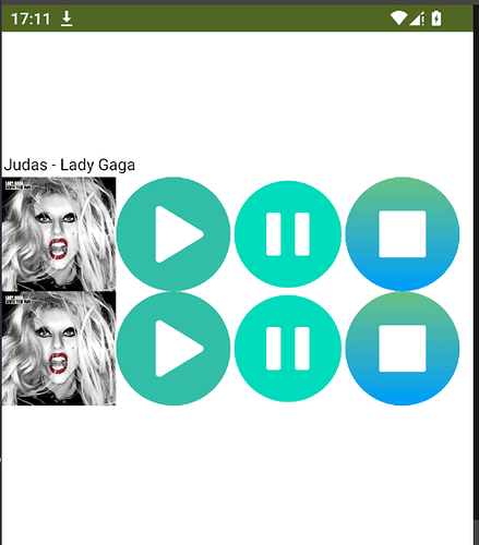
No issues on Android device...
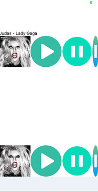
perhaps is an ios issue ?
Note you should not share copyrighted material/assets on this community.
iPhone 6s:
If you want the HA to fill the screen, you need to adjust the size of your buttons so that they fill the width of the screen. In addition, the height of the HA must be adjusted/defined accordingly.
@Patrick_Gutierrez You are welcome!
All images used in the designer are perfectly square... but the image of Lady Gaga has a size of 640x604px... while the buttons have 512x512px...
When the 'Width' property of 'HorizontalArrangement' is defined as 'Fill Parent' will take the maximum width of the device screen... however, if the 'Height' property is defined as 'Automatic', the height of the arrangement will adapt to the content that is placed inside it... and it will be unknown to actually have a content there...
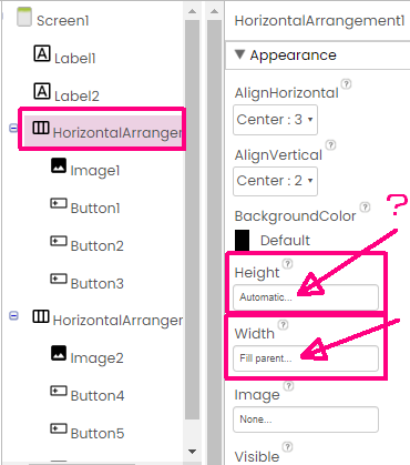
In this context, when inserting the largest of the components within the arrangement -which is the image of Lady Gaga- if the 'Height' is defined as 'Automatic' and the 'Width' it is defined as corresponding to 25% of the Width of the Arrangement to which it belongs, immediately the Height of the image will be calculated so as not to lose its 'square proportionality' and will respond to the following calculation »
Height = 25% of the device Screen Width
And because it is the component with the largest size, this Height will define the Height of the Arrangement to which it belongs (defined as 'Automatic').
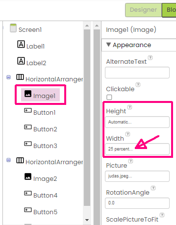
Now that the Height of the Arrangement is defined by its largest component, the Height of each button can simply follow the 'Fill Parent' criterion to adapt to this... and the Width of each button will follow the criterion of 25% to equally correspond to 1/4 of the Screen »

When these same parameters are replicated in the second Arrangement, the result will be what you expect, with identical image and buttons, without losing the originally square proportionality »
However, I do not guarantee that this is what will be displayed on the AI2 screen on your desktop. ![]()
Lito
@>-->---

