CardView Extension for MIT App Inventor: Elevate Your App's Design
Give your App Inventor projects a modern, sleek look with the CardView extension! This powerful extension allows you to effortlessly transform any layout into a native Android CardView, enhancing its visual appeal and user experience.
No more boring rectangles! With CardView, you can:
-
Instantly enhance layouts: Wrap any arrangement or component in a visually appealing card with just a single block call.
-
Customize extensively: Fine-tune every aspect of your card's appearance, including:
-
Shape and Corners: Control corner radius for rounded edges.
-
Elevation and Shadows: Add depth and dimension with customizable shadows.
-
Colors and Borders: Set background and stroke colors, along with border width.
-
Padding and Margins: Precisely control spacing within and around the card.
-
-
Add interactive elements:
-
Enable click and long-click events with customizable foreground ripple effects for a modern touch response.
-
Easily detect user interactions through dedicated event blocks.
-
-
Maintain flexibility:
-
Seamlessly revert to the original layout using the ClearCardView function.
-
Preserve your existing layout structure and component hierarchy.
-
Benefits of using the CardView Extension:
-
Modern UI/UX: Instantly modernize your app's interface, aligning it with current design trends.
-
Improved Visual Hierarchy: Cards naturally group content, making your app easier to scan and navigate.
-
Enhanced User Engagement: Interactive cards with touch feedback create a more engaging and delightful user experience.
-
Easy Integration: Simple blocks and properties make it incredibly easy to use, even for beginners.
Functions and Examples:
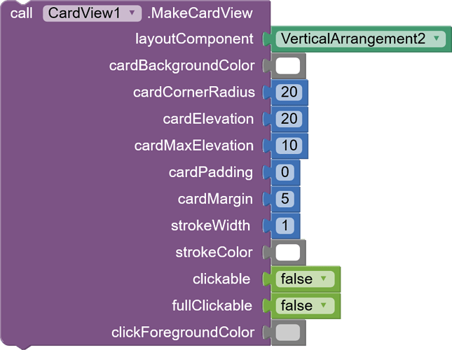
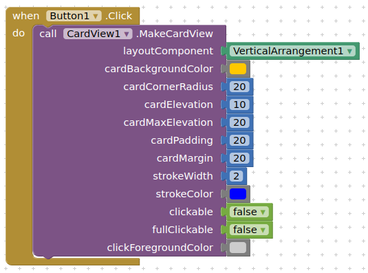
1. MakeCardView
Purpose: Transforms a layout into a CardView, applying various styling options.
Parameters:
-
layoutComponent (AndroidViewComponent): The layout you want to convert into a CardView.
-
cardBackgroundColor (int): Background color of the card (use color blocks).
-
cardCornerRadius (float): Corner radius in pixels (e.g., 10 for slightly rounded, 25 for more rounded).
-
cardElevation (float): Elevation/shadow depth in pixels (higher value = stronger shadow).
-
cardMaxElevation (int): Maximum elevation of the card (relevant for shadow behavior).
-
cardPadding (int): Internal padding within the card, applied to all sides.
-
cardMargin (int): External margin around the card, applied to all sides.
-
strokeWidth (int): Width of the card's border in pixels.
-
strokeColor (int): Color of the card's border (use color blocks).
-
clickable (boolean): Enables/disables click functionality for the card.
-
fullClickable (boolean): Enables/disables long-click functionality for the card.
-
clickForegroundColor (int): Foreground color (ripple effect) when the card is clicked (use color blocks).
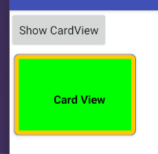
Example:
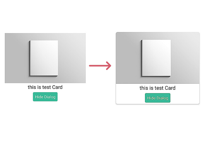
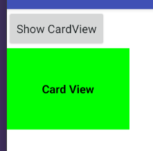
result:
2. ClearCardView

Purpose: Reverts a CardView back to its original layout, removing all CardView styling.
Parameters:
- layoutComponent (AndroidViewComponent): The CardView you want to revert back to its original layout.
Example:
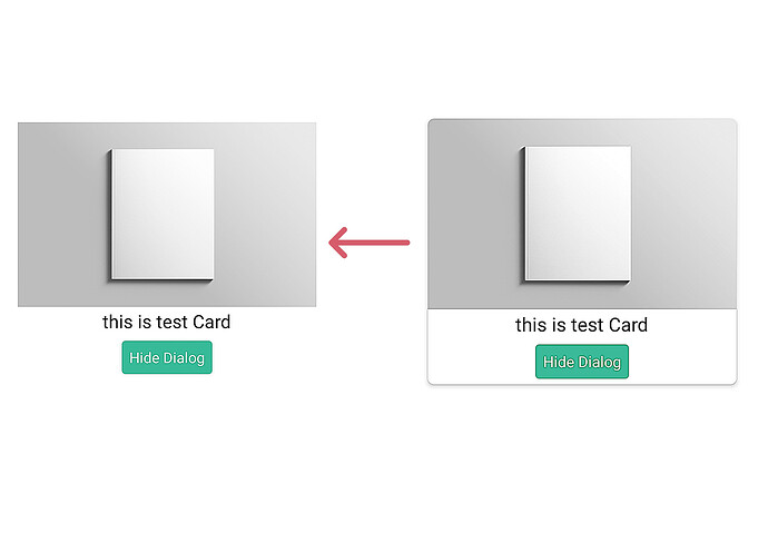
Result:
3. Events
The CardView extension provides two events to handle user interactions:
-
CardViewClick: Triggered when the CardView is clicked.

-
CardViewLongClick: Triggered when the CardView is long-clicked.

Aix File:
![]() CardView.aix (33.8 KB)
CardView.aix (33.8 KB)
What Do you think about CardView extension ?
- Execellent
- Very Good
- Good
- Bad

