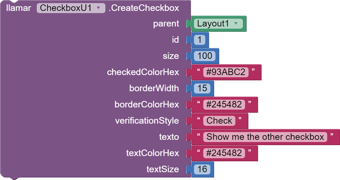
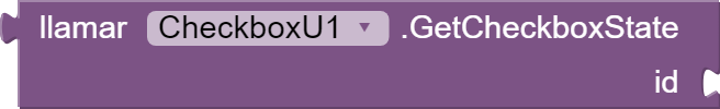
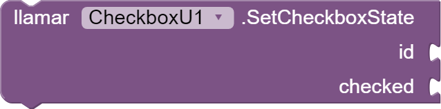
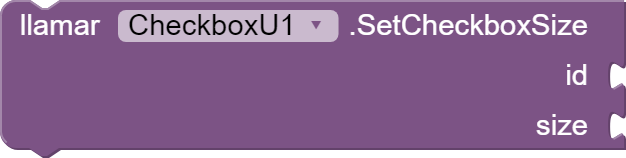
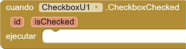
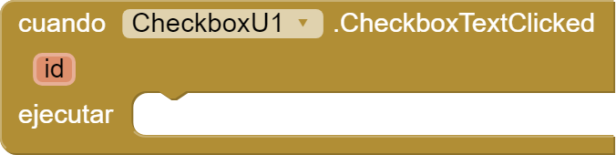
Configure the size, border color, fill color, and verification style of the checkboxes. Additionally, it includes an event that is fired when the checkbox changes state.
Hi, I am new to App Inventor and I think I don't understand yet how to use this extension. I've installed it, but I don't get the call block above, but a slightly different one (no drop down list for CheckboxU1, just call CheckboxUCreateCheckBox, and an extra notch for Component which I don't know what block to fill with). And where should this call block go? Thank you!
EDIT: OK, I figured it out, Component should be filled with CheckboxU1, now to figure out the second part of the question, where does the entire call block go to create a custom checkbox.
Hi and thank you for the quick reply! I restarted and I got the call block to look exactly as above, but I still haven't managed to use it properly, sorry. I will send you a message with the .aia now, thank you again!
Yes, but imagine expand it to dynamics forms creation, social or product or customer surveys, etc.
Because sometimes you need information about feelings and how it made you feel because 0 to 100%, 0 to 10, True or False, etc. It does not return the necessary information.
That's why there's a lot of difference in how something or someone makes you feel, sense, and what you think and thought about it, etc.
Many times the reactions to something or someone are varied, including "weird".
all that emotions, feelings, thoughts, and reactions can be measured by True, False, even the Null ones gives you information about.
Memerize information:
= it's ok = Whaaaaaaat....!!! = i like it = Dont like it = I'm not interested, it's even worth my time, try something else. = WaTaFuuuuu!!!!!????... = Angry = Rage = Insult = Ooooohhh... wooooo!!!! Blow my mind!!!! = Astonished, I dont want it... i need it!!!! = Amazing! i want more = Amazing.
And now... What if?? every reaction it's stored (True, False, even Nulls) and take it by an a LLM like GPT, and resume reactions from 0<X.xx <100 about your actual/next product.
And balance Decisions, projects, etc. on that resumes?


 = it's ok
 = Whaaaaaaat....!!!
 = i like it
 = Dont like it
 = I'm not interested, it's even worth my time, try something else.
 = WaTaFuuuuu!!!!!????...
 = Angry
 = Rage
 = Insult
 = Ooooohhh... wooooo!!!! Blow my mind!!!!
 = Astonished, I dont want it... i need it!!!!
 = Amazing! i want more
 = Amazing.