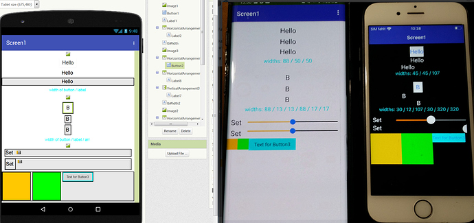
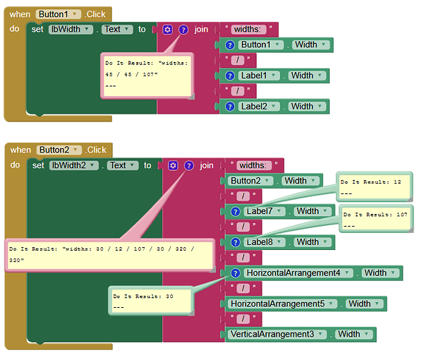
Here is my third test with iOS, this time regarding the design.
As expected, there are numerous layout / design differences with iOS, especially when using arrangements. design_iOS.aia (3.2 KB)
Are there any instructions / hints that I missed?
Designing with iOS (Xcode / Swift) is completely different (→ constraints, stack views, stack views in a stack view, auto layout etc.). Getting it right is really a challenge.

