![]() Introduction
Introduction
A non-visible extension that contains a circular running artifact that can be used to indicate loading.
![]() Version: 2
Version: 2
![]() Package name: com.gordonlu.circularprogress.aix
Package name: com.gordonlu.circularprogress.aix
![]() Release date: 2022-04-18T09:00:00Z
Release date: 2022-04-18T09:00:00Z
![]() Built with: Niotron IDE
Built with: Niotron IDE
Here are some points you need to notice:
-
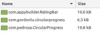
the container should only contain the circular progress, just like the RatingBar extension by AppyBuilder. If you have other components in the container, the circular progress bar will overlap the components.
-
set the height and width of the container to the desired height or width of the circular progress, the extension will automatically adjust.
-
each of the IDs of the circular progresses should be unique.
-
this extension only works if you have not set Theme of Screen1 to Classic
![]() Documentation
Documentation
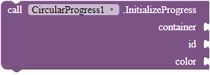
InitializeProgress
Creates a circular progress in the container. The container can be a vertical or a horizontal arrangement.
Parameters: container = component, id - number (int), color = color
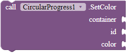
SetColor
Sets the color of the circular progress in the container, according to the given ID.
Parameters: container = component, id - number (int), color = color
SetVisibility
Sets the visibility of the circular progress in the container, according to the given ID.
Parameters: container = component, id - number (int), visible = boolean
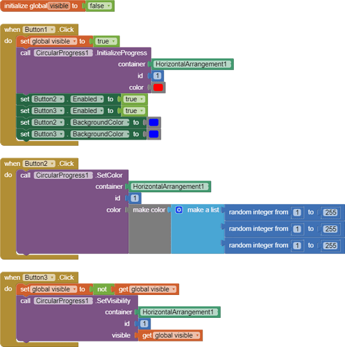
![]() Blocks in usage
Blocks in usage
![]() Credits
Credits
Thanks for @Anke for fixing bugs!
![]() Downloads
Downloads
AIX: com.gordonlu.circularprogress.aix (6.8 KB)
AIA:
Progress_New.aia (8.5 KB)
JAVA: CircularProgress.txt (3.0 KB)
Made with Niotron IDE.
Kindly ![]() PM me if you have any questions! Also, if you like my extension, please
PM me if you have any questions! Also, if you like my extension, please ![]() like it! It takes some effort for me to make it...
like it! It takes some effort for me to make it...
Likes tell me the general user feedback of my extension. If you read this extension, please take 20 seconds to drop by and give a like!
If you have any features that you want to add and you know the code, PM me or directly reply below using the ![]() button.
button.
If you find any ![]() bugs, please reply below.
bugs, please reply below.
Gordon Lu


 Takes less than 30 seconds. It's just a simple extension.