OK, I guess an example will be forthcoming....


It doesn't work ![]()
are you clearing tinyDB before a new test?
yes
1 Like
oh well I forgot to put a block
now it works perfectly
Thank you very much😁
I hope I don't encounter any more errors!.
thank you all.
Hi everyone, I wanted to know if it was possible to click on a value in the graph and say some more information about when that value was added.
Thanks
You can have a look through the configuration options for your chosen chart style to see what is available, but from what I can see it is not possible to display, on the chart/label/tooltip, anything other than the values you input for the chart.
What you could do is capture the data returned by selecting a chart item, then use that to select additional information stored in an AI2 list in the app, then display this in a label or perhaps a popup dialog.
ok thanks<3
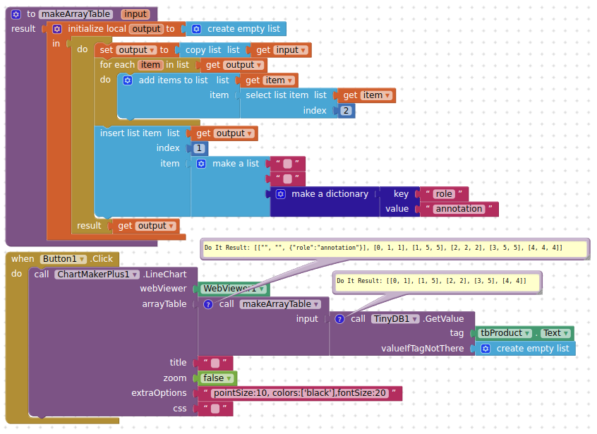
The app is retrieving data from a firebase database and presenting it with a ChartmakerPlus line graph.
I would like to add a target line. Since the graph can be called to show 8 different group of data. So, I will need 8 different target lines.
I can add a sub-group of the database with each group's target or even hardcode the targets as constants.
I am thinking one possible method is to code a constant in a second column in the database?
Attached is the blocks of creating the table that is passed to the ChartmakerPlus.

What am I making difficult?
Quickest/Easiest way to achieve this:
(using the example aia project I have provided)
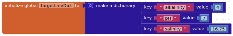
Create a dictionary containing keys that match the tags in Firebase, and values for each target:
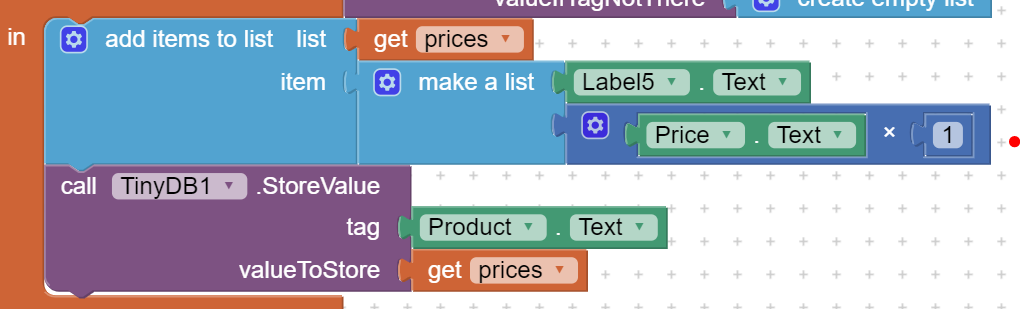
Add these to the arrayTable list for each row:
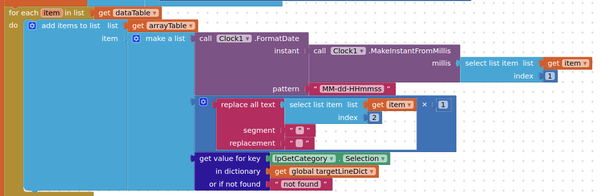
Add a header for Target:
aquariumFBwithChartTarget.aia (17.2 KB)
Thank you - they was exactly what I was trying to do.
I have the last piece. The middle piece is where I could not think of.
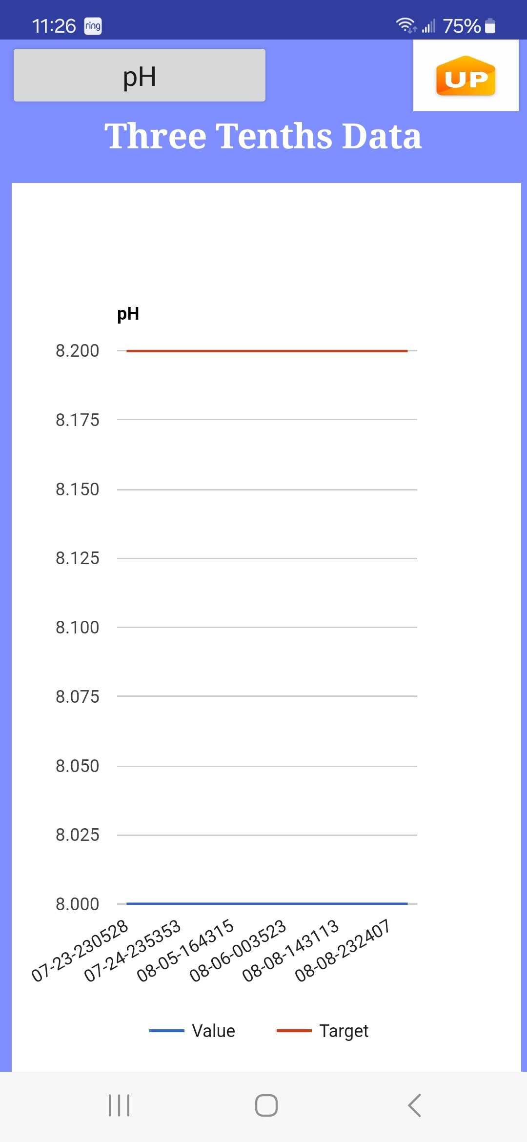
How can I control the X axis in the graph? For example, the pH graph the blue data line is at 8.0 and targetline is 8.2. Can I eliminate the .25 increments and keep it at tenths? can I start the X at 7.7 and have 7.7, 7.8, 7.9, up to 8.5?
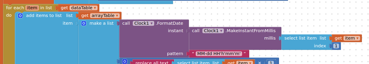
The date/time across the bottom - I need to keep the seconds in the data for sorting, but would like to truncate down to just hours / minutes on the graph display as "07-23 24h05m"
1 Like
Yes you can, you can set the limits for the x axis wherever you like.Read the line chart documentation:
Then apply your requirements in the options socket
You can find a similar example @ 100 posts up:
1 Like
I got the graph showing using a the options block. Since there are eight different sets of maxValue and minValue, can I put an if/then group with a join block for each true if OR should I create a constant for each category and load a variable to plug into options?
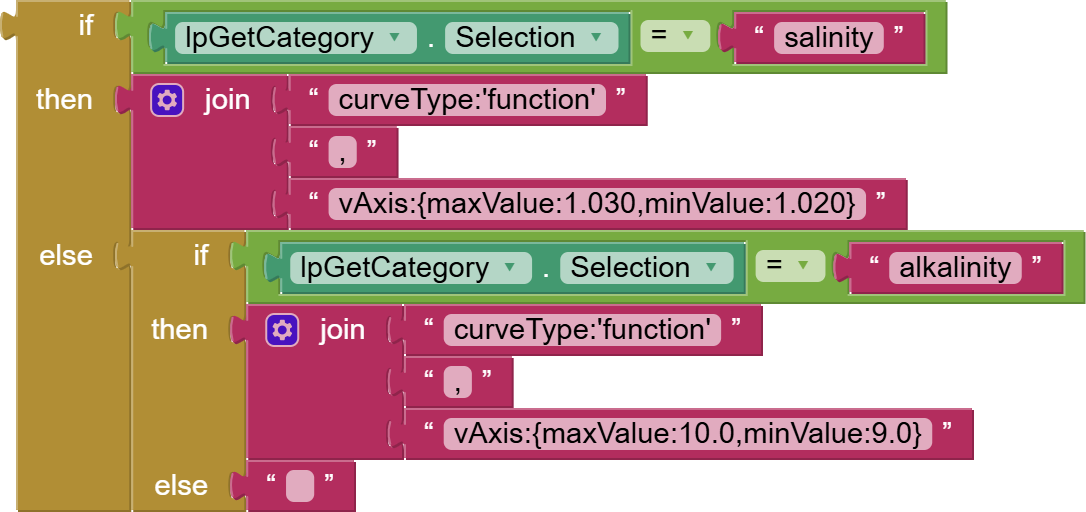
The if / else is working but seems clunky
1 Like