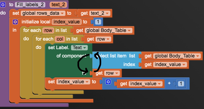
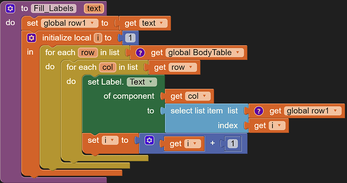
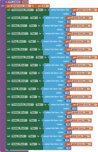
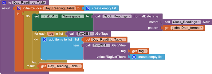
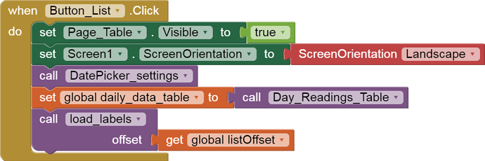
Swap them as...
...unfortunately it doesn't work
it shows the same error warning as before
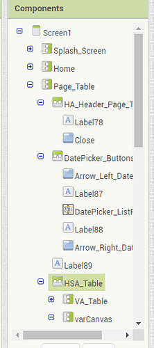
I suggest you add the required Canvas and buttons Vertical Arrangement before diving into the coding of the display of the current window into the data. You will need them to get the current offset, which you are missing in your blocks.
Once you have all that, post a fresh .aia export.
col is needed here not row, didn't copy well 
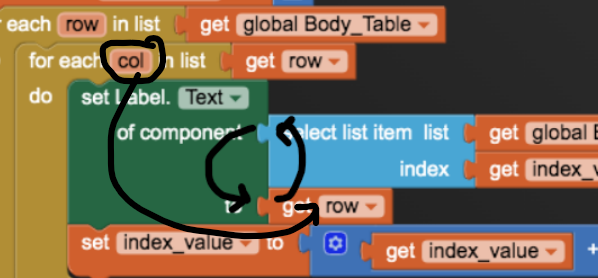
this is what it is to be
Note: for robust solution and great learning, I recommend you should follow ABG's suggestion.
I have to point out the difference between the two different types of loops over lists:
- for each item in list
- for each number from 1 to length of list by 1
Use the first when you only care for the contents of the list and you don't care for the order of the list.
Use the second loop when the order is important and you are matching one list against another list, index by index. Be prepared to use the select item from list block in that loop, using the list index from the loop block. There should no need to ask for a new local variable to act as a list index in that circumstance.
P.S. I have updated my sample to cover cases where the incoming data table has fewer rows than the Label table.
Thanks Ram anyway 
My good intentions weren't enough to place the components you requested, ...not knowing what it's for, where to put VA, Canvas and buttons.
So I just cleared my project of unnecessary blocks and attach the .aia file.
Nadi_06.aia (953.4 KB)
Thank you
I see in your blocks you did not distinguish between a table and a tapeworm:
Here is where the scroll bar went:
This procedure returns a true table (not text)
This is the new procedure to call:
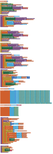
and here is new source code with it all integrated...
Nadi_06 (1).aia (956.8 KB)
(I did this because I failed to properly parametrize my procedures in my tutorial. I do not do this often, and do not rely on me for this.)
I'm studying your solution. Thank you.
Can you explain the meaning and function of the "offset"?
![]()
![]()
![]()
The offset is the relative position (counted in rows) of how far down the small fixed display window has been moved down the larger data table.
Here is another example using an offset, in only one dimension:
In your solution I will have to create 50 lists/rows, am I right?

You only need to create as many rows in the Label table as you can fit onto your phone in landscape mode that would be visible without scrolling.
How big is your phone?
This reminds me of an old joke:
A man goes into a hardware store, looking for something to help him cut down a tree. The salesman sells him their finest chainsaw. The customer returns later all tired, bloody, and sweaty, and throws the chainsaw down on the counter. "This chainsaw can't cut anything!".
The salesman take the chainsaw, verifies the chain is seated properly and lubricated, and that the chainsaw has gasoline. The salesman pulls the starter cord, and the chainsaw roars to life. The customer, startled, asks "What's that noise?"
My app will be displayed on various devices, including tablets. It depends on the user's choice.
The number of rows you display in Labels is a compromise between
- what will fit on the smallest device screen without scrolling
- your patience in adding extra rows of Labels to the screen and to the label_table component table in the Blocks Editor.
Off the top of my head, I guess 6 rows should be enough to fill the screen without overwhelming the user. This all user taste, which I leave to you.
The blocks measure length of list against the label_table, so they will adjust automatically.
After considering your, Abraham and Ram, solutions and suggestions, I created my table.
I kept my Scroll Arrangement component. It doesn't take up space, it's easy to use for the user, and it's easier for me to manage.
For now I have set 10 rows, but later I will add more.
I made hide the rows/Horizontal Arrangements that don't contain data.
I matched the Namespace TinyDB data with DatePicker.
It works.
...but I have some questions:
-
how can I improve and simplify my blocks?
-
why doesn't Horizontal Scroll Arrangement work? ...it contains the whole table
-
can you explain why I had to set quantity "0" instead of "-1" or "+1"?
-
how can I set the "right arrow" disabled when the date in the DatePicker is set to instant "Now" (after changing days backward and forward)?
I assembled the blocks like this but it doesn't work:
Nadi_07.aia (958.4 KB)
I found the solutions and improved my blocks.
Now, how can I create my customized DatePicker popup Calendar?
...I would like to mark the days on which the data is stored.
This is a sample I had lying around.
You would have to customize it to fit your app's data storage.
P.S. For an inspiring example of visualization of time-based data, see http://histography.io/
(Not an offer to program it for you)
Yes, very creative mind ....like all the App Inventor community ![]()
...so

Thank you
When I am clicking the datepicker my calendar starts, but automatically the popup dialog also starts. How can I disable it?
