Sounds good to me.
Well... I do a small test. On my tablet screen fits about 128 cels!!! And I think that can be ergonomics enough for eyes.
U_S_test.aia (4.4 KB)
I have some questions, I think that I did something wrong.
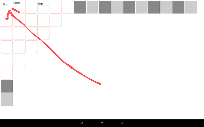
Where the arrow is... I don't have the red square with round corners!!! Do I do something wrong?! Is it a possible bug of AI2?!
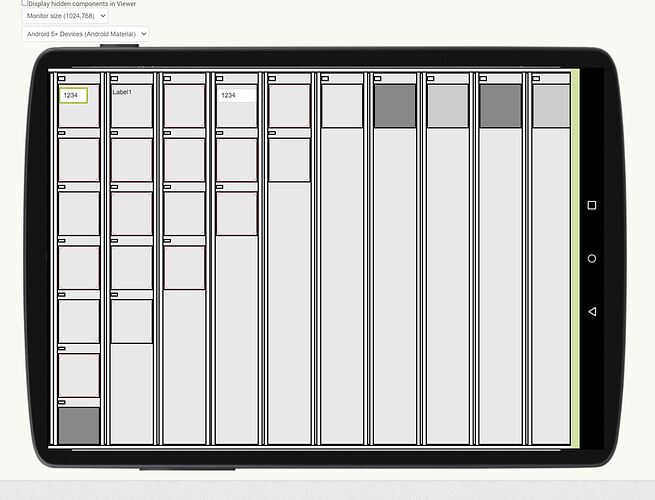
On AI2 I have it...
Another question, why I don't have around the text box a round corner rectangle with a white background that I have on AI2?!
What do I do wrong?!
Thank you, Dan
PS - Seems that the cells are small enough that I can't play with the util space to draw something like a puzzle piece (I'm happy about that), I must be happy with somehow elegant round corners (Apple inspired...). Sometimes less may be more... So, fewer complications with design!!!
Please forgot the red square, I was lost in space and forgot a block that I'll test it... my mistake...
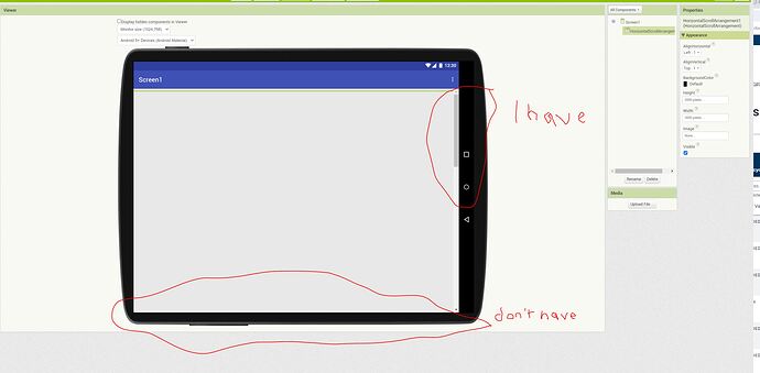
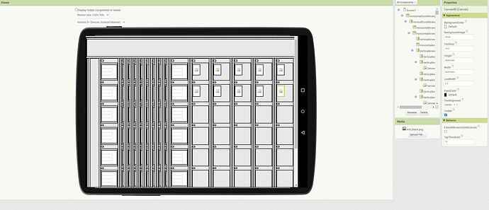
I have two problems, at this time. The first and biggest problem is the design possibility of AI2. As you can see in the above images the entire design I have on the tablet doesn't fit on the AI2 design screen. That was and will be a nightmare because as I built the app, it came more and more ideas and I had to update all 128 cells. I do not know how to fit the entire design into the development screen.
Second problem...
U_S_test_1.aia (16.6 KB)
I draw a round corner square shape in two noob variants, of course, these are not ideal variants.
The ideal variant probably is DrawShape with some Lists and some more or less complicated math. But I'm not a genius in this. But...
I see here, in this community some genius, @ABG for example... That if can, if it wants, if it has some time... Almost sure that will help! Of course, there exists more genius here!
Thank you, Dan
First Problem
Use scrolling arrangements to allow viewing of all components
Second Problem
Don't draw at all. make a transparent image of a square with rounded corners, and apply that to each canvas. If you want it filled with colour then do much the same.
Thank you for the first tips.
As you can see I have a .png that I'll use for the background of vertical arrangements, I tested it for the canvas background and it works ok... But... It is not best to draw directly on the canvas with a good approach and not put .png images? I ask from the resource used point of view...
I think that if I directly draw on canvas, it is somehow a vectorial approach. A vectorial approach is not better than... let's say... bitmap approach?! Another advantage of direct canvas drawing is that I can dynamically change the color, shapes... and so on. In the future, I want some shapes to "blink" and more. For me, seems to be easiest to do all this on direct drawing on canvas. Correct me please if I'm wrong.
Thank you, Dan
Have you ever played an RPG game in the last 10 years?
They do a great job of providing views of different data at varying scale levels.
Once you reach a certain volume level, you can't see everything all at once.
Here are some samples of a small sliding window over a larger data list ...
https://groups.google.com/g/mitappinventortest/c/WEat3QJXUX4/m/-r3mNVSIAwAJ
Thank you for your reply, @ABG. It seems there's a misunderstanding regarding my issue with scrolling. Allow me to clarify:
Imagine I have an arrangement with a width of 3000px and a height of 2000px. In the AI2 online designer screen, there's no horizontal scrolling option available, making it impossible to reach the 3000px point. Even with 128 cells, as shown in the images above, I can't access the cells on the right that are hidden off-screen.
Example:
Scrool_test.aia (1.1 KB)
Additionally, I'm encountering difficulties implementing the best practice design for canvas drawing using the "DrawShape" component, as you suggested. This approach requires a level of expertise in working with lists and math, which I currently lack. Unfortunately, I haven't been able to find any documentation or examples demonstrating how to use "DrawShape" with lists and math to draw any shape with round corners. If you could provide some guidance or examples on this particular topic, it would be greatly appreciated.
I draw on the first two canvas square shapes with round corners but in an empirical manner, also in the rest of the cells, I use .png files to display square shapes with round corners. Also, in the U_S_test_1.aia from above (I didn't upload once more time, exists above), you can see my problem in AI2 designer with horizontal scroll.
Thank you, Dan
PS - The last time that I play a game... It was in '93, and was Wolfenstein on Windows 1 if I remember correctly, on a 386 with 8Mb RAM and 50Mb HDD. We play in 6 comps network, and we play almost continuously (day/night) for more than 3 months until all touch the end of the game (the part where Hitler died). That month almost ruined our lives. I'm a part of that species that is uncontrollable in front of a game. No more games.
For me, adding so many columns in a screen, and you have to scroll horizonlly is not a good idea. instead, you can add more rows and scroll vertically, and in one row you have 4 or 5 cells (can not too much).
to make a round corner layout, you can use this extension:
and in case you need a list of more than 100 buttons in order, you can use this extension
Thank you @Kevinkun , In the final app I don't have scrolls.
The app for the moment runs on a Doogee 11 inch/2.5K tablet, next week will run on an almost 13 inch/3K Lenovo tablet. In the future, I plan to use a 27-inch touchscreen 4K monitor with an Android desktop system. This app is not a usual app designed for phones or such things, it is an app for electronics services. It will be used on a dedicated hardware app.
Thank you, Dan
PS - I already saw your extension, it is on my list... ![]() but I prefer don't use extensions if it can be made with native AI2.
but I prefer don't use extensions if it can be made with native AI2.
For example, @ABG does some magic with math, lists and so on... drawing some stars, is a huge source of inspiration... But... not even one corner... Have a round shape.
![]()
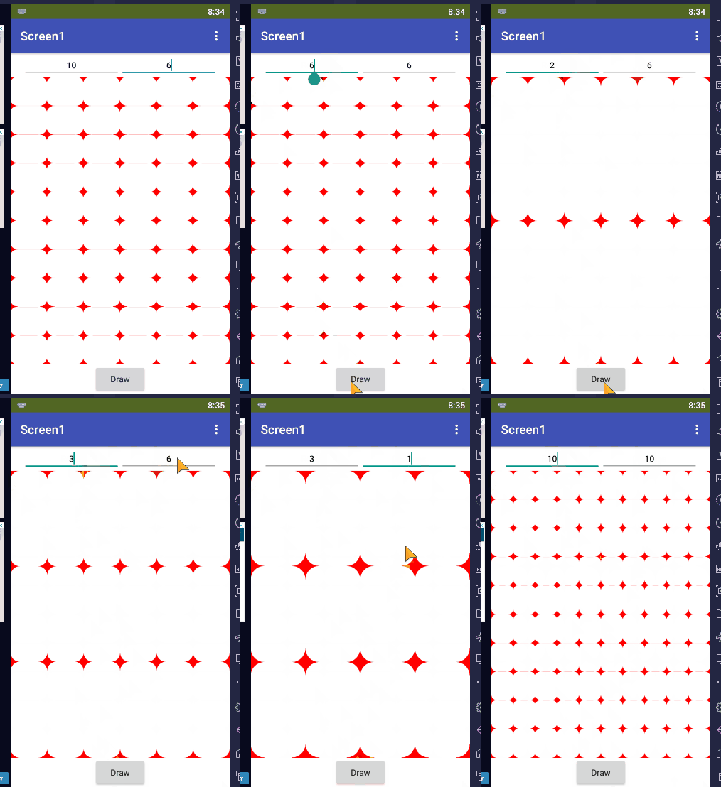
canvas_buttons_rounded_corners.aia (6.2 KB)
A rounded cornered rectangle is basically a fat + sign with circles drawn at its corners.
The draw shape is tracing out a plus sign.
P.S. Mixing up the colors would make the rectangles stand out more.
Thank you very much @ABG for this example, indeed is didactic. But... let's respect the KISS principle, let's simplify those things and don't complicate them more.
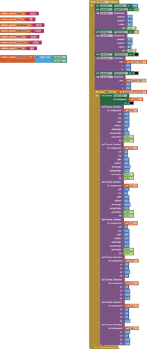
Here's an image with my blocks that draw (for the moment) two round corners square shapes. I can easily extrapolate to all 128 cells.
For the moment, the rest of the 126 cells have a .png as background. I can delete the 126 .png's and put 126 canvas in their place, add to initialize block, as I use any component/canvas... All are easy to extrapolate. But...
As ABG says, it is possible to use:

and it may be right. If it is right all can be simplified. By the way... I see on a thread that Kodular has something like draw polygons and if I remember correctly it can directly round the corners. But... It is not our case.
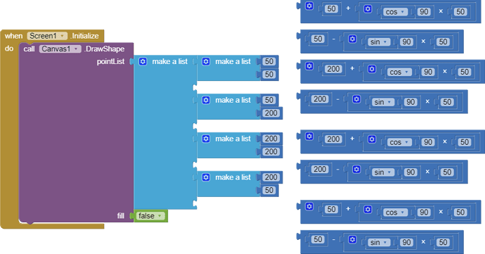
Now... I test this approach, which at this moment draws a simple square, without rounded corners. From what I remember from kindergarten time, the unused blocks can draw some arcs (I must search, on my best friend Google to be sure...).
Now... My question is how can I interlace the blocks that I hope can draw arcs in the free spaces from the left blocks? And the big problem is that the unused blocs will draw point by point. So... Must be adapted to the segment.
For me seems to be a best solution that I have in the above large blocks.
Thank you very much another time, Dan
PS - In fact, I need the equation behind this block...
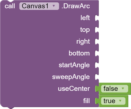
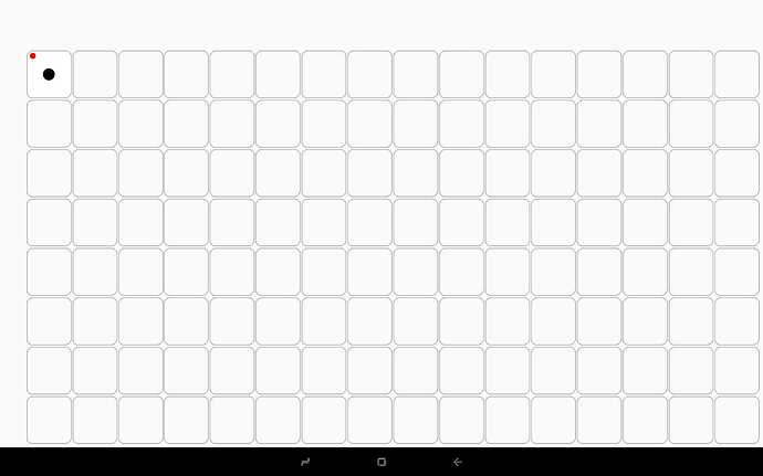
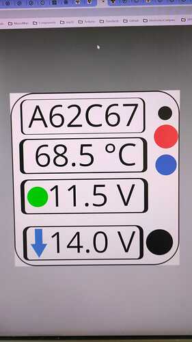
Seems that @TIMAI2 was right, drawing on canvas is a tricky business. I say that because in the final I need something like this...
That means at least 6 round corners square drawings on canvas. This is unsustainable. I let out blinking squares, and to give some advert I'll blink some balls or other simple things.
So... From my point of view... A .png as the background of all cells canvas is the future. Far less complicated... I have time to complicate other things in the future.
So... On the didactic plan... In this case... drawing on canvas = is a complicated path, use a .png.
Thank you all for the precious time and advice, Dan
PS - For TIMAI2 - I do the images before you write here your opinions, I do that only because was... The simplest way... ![]()
Connecting (more than) 100 ESP devices is possible with ESP-Now, a communication protocol from ESP. That is according to their own documentation: ESP-Now FAQ
What is the maximum number of devices that can be controlled by ESP-NOW?
This depends on the specific communication method:
- If unicast packets are used, up to 20 devices can be paired and controlled at the same time.
- If ESP-NOW encrypted mode is used, up to 6 devices can be paired and controlled at the same time.
- If broadcast packets are used, theoretically there is no limitation in the number of devices that can be controlled. You only need to configure the correct broadcast address and take care of the interference issue when too many devices are paired.
Thank you for your reply, as you can see it says up to 20. I read this info some time ago. Things with more than 100 pcs. of esp32 are some personal interpretations. The maximum number practically confirmed that I discovered was about 60 pcs... if I'll correctly remember.
In fact, is very important what you broadcast not the number of broadcasters. Let's explain me...
Is not the same thing if you want to broadcast 100 SPI cameras with 40 Mbps or 100 CAN-bus with 1 Mbps or 100 strings with 100Kbps.
ESP-Now seems to be able to control a large number of devices... But... you have only 150 Mhz at your disposition " The Wi-Fi API provides support for the 802.11b/g/n protocol driver".
So... more than 100 pcs. of esp32 must be experimented and proved. We... the human species have a very weird sin... We like to hear each other talk... We make tons of affirmations. To give veridicity at this affirmations... We need to prove it, otherwise remains... simply rumors (to not say forbidden words...). The internet has plenty of... forbidden words, in fact, my beloved internet was transformed into... content without content.
Thank you, Dan
@Kaytlynn_O_Briant_St Let's see... "It's easy to write lyrics... when you have nothing to say..." Write with time ago a poet.
Please, if you have nothing to contribute, do not pollute here... If it is interesting for you, read it and I'm glad to see you... But don't pollute.
Thank you in advance, Dan
PS - Somebody can delete the last two non-sense posts?! This happens when some Tik-Tok ghosts are teleported into the real world...
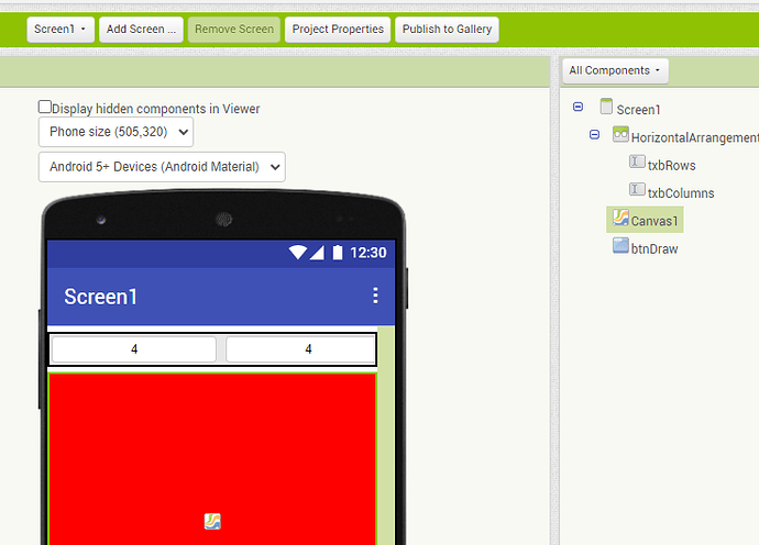
A last example about the horizontal scroll problem that I have. To access the right cells that are hidden off-screen, I must modify the width of the already done cells from the middle right of the screen from 75px to 9px, to bring on the design useful part of screen the hidden cells to add canvas/background for canvas... and so on. After I finish that part, I must correct the width of the already minimized cells from 9px to 75px, to have a correct preview of my work.
I know that AI2 is specially made for phones/low-resolution tablets/Chromebooks. But the future arrived, this wonderful piece of software that is MIT App Inventor if it can be used on... Let's say scientific purposes... Where a lot of data is processed and must be displayed... It needed big screens. As the world tries to put a computer in our pockets, and that is a piece of wonderful news... The same world doesn't accompaniate this microcomputer with some microscope like... Vision (or... howk/eagle vision ![]() ).
).
If somebody from MIT is curious about the nightmare behind this work... I can count for them how many times the editor crashes, how many times the companion crashes/stuck, and so on...
One after the other, anyway... AI2 continues to be my... secret love ![]()
Just make them not visible
