So noted. That is worse because the "Publish to Gallery" button should be an icon, and I haven't figured out why it is not appearing that way in production.
I will say that we don't officially support phones. We have plans to offer an actual phone layout, but it's in the early stages and involves a lot of work.
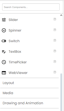
a minor improvement might be to reduce the space between the different drawers to be able to display more drawers without scrolling
also the media section could be moved down to use the available space for the drawers more efficiently
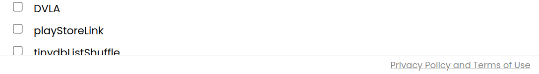
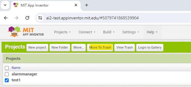
Last project ( I presume) in projects lists, when more than a screens worth, so need to scroll down, is partially obscured by the Privacy Policy bottom bar:
Another thing I noticed while scrolling towards the bottom with the dialog open is that the background t the bottom is completely blank. I think that blank could be used efficiently...
I think the new interface is too bright, it may be just because I'm a dark-mode user but the old design's grays made it more bearable to look at, I'd like if you add dark-mode to App Inventor.
Another thing is that the new design is so spacious, it feels empty, and more white space isn't really helpful when using a 4:3 screen, specially with such an interface full of buttons and elements that go offscreen and break layout...
There are too many scrollbars, both in the Designer and the Blocks editor, especially when I use a component with a long name (HorizontalScrollArrangement). Kind of hideous to look at, and inconvenient to find components. Maybe shorten the width of the scrollbars, or use the round scrollbars in the Blocks Workspace.
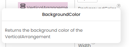
The property tooltips cover components in the Component Tree, and cannot be dragged around.
Maybe we should take a page from Kodular's book and instead display the infobox below the property name instead.
The Properties panel is too wide, especially when I select a component with a long name. Maybe move the component type somewhere else, e.g. below the component name, and include a component icon as well. Easier to navigate around the Designer.
There is a separate dark mode coming for both interfaces, but it is dependent on an update to App Inventor that allows us to use a custom theme for Blockly.
These are the new issues I've picked up from the thread.
Privacy footer covering bottom of screen in project explorer (@TIMAI2 )
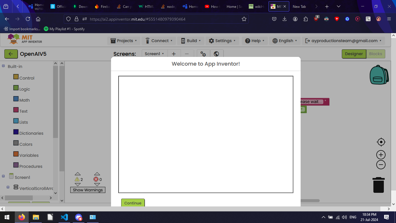
Large dialogs (e.g. Welcome and splash screen) can size larger than the screen height. (@AyProductions )
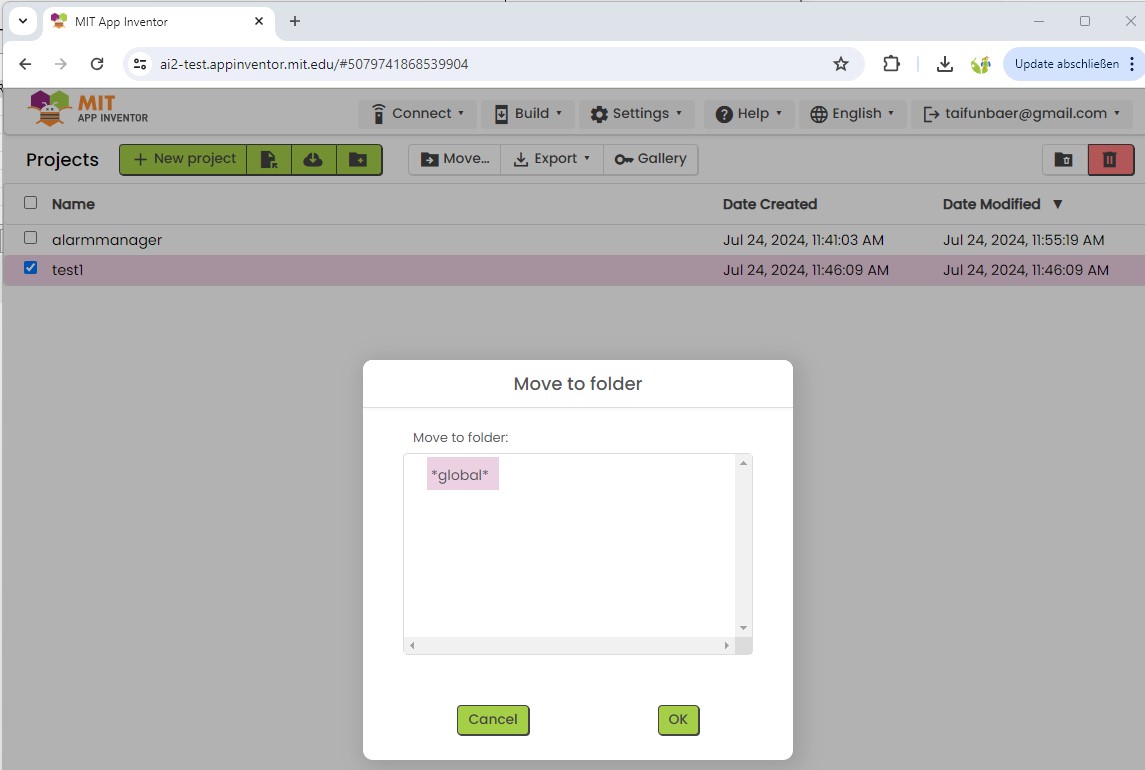
Description popups can't be dragged, which is a problem for Properties in particular, where the popup covers the property it's describing (@gordonlu310 ). This exists in Classic as well.
Properties panel does not size properly when the header text is wider than the specified width. (@gordonlu310 ). It should wrap if possible.
Scrollbars on Windows are still causing issues.
Tracking suggestions as well, but I'm trying to note the bugs explicitly.
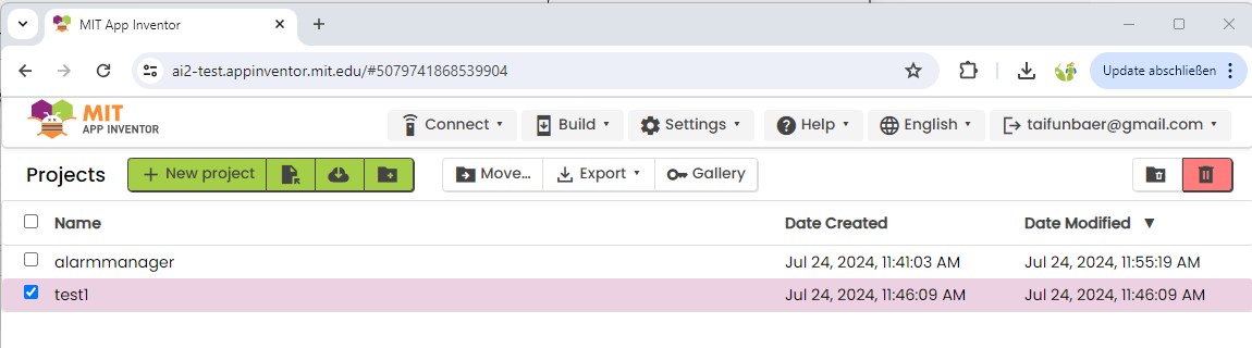
You tried the red trash button on the right-hand side?
That is the official Material Symbols icon for moving to trash, but I'm not thrilled with it. It seems too ambiguous to me. I'm considering changing it to "delete sweep," whatever that was intended for, Material Symbols and Icons - Google Fonts
Do you think that looks more like moving to trash?
If I use the AI2Helper script to find blocks, the button AI2HELPER appears only in the projects screen and disappears in the work area screen,
whether I use dark mode or not on the browser (Opera).
The AI2HELPER button appears okay on work area screen on classic interface.
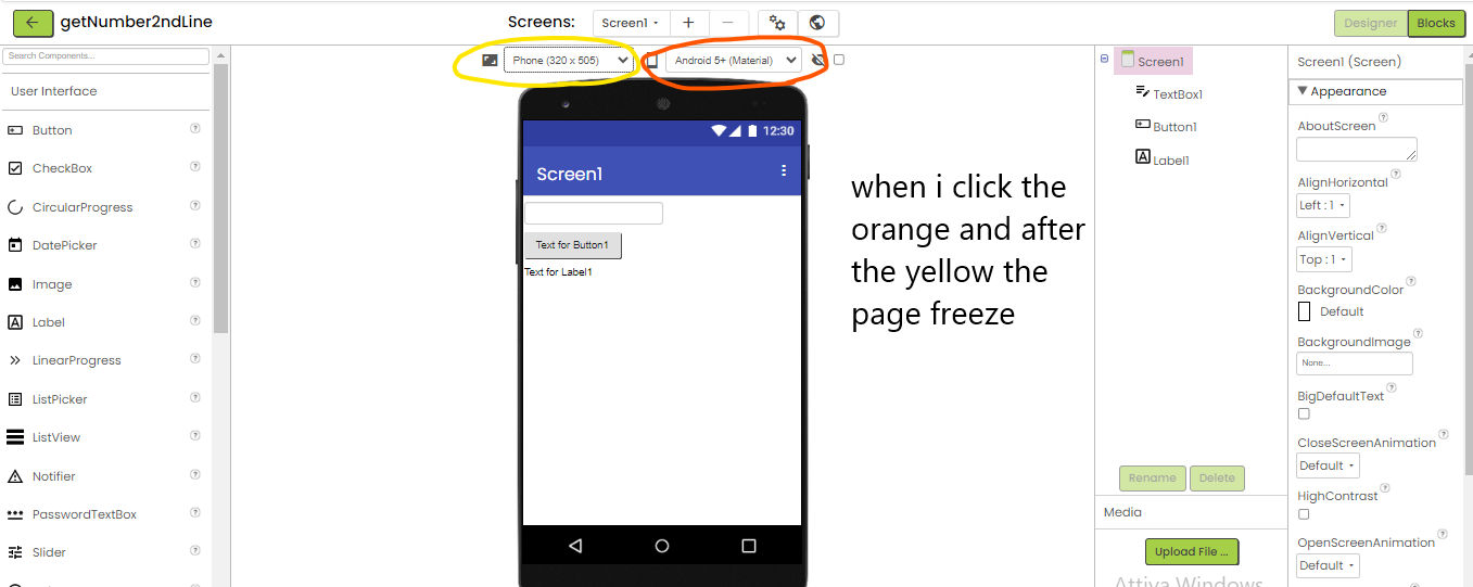
Hi everyone, I was trying the new neo style but I found this problem when I click on the drop-down menu with Android 5+
and after I click phone size the site doesn't respond for a few seconds in the old template it doesn't happen
it's a problem with my computer ? if is sorry