After years of work, we have now released a new updated user interface for App Inventor!
It's currently in open beta and is optional to use. Our plan is to make this user interface the default in another year.
We encourage folks to try it out! You can change user interfaces in the settings menu like this:
Overhauling the user interface is a big undertaking. There are still going to be problems and bugs. We welcome feedback and bug reports posted on this thread. In order for us to be able to use your feedback, please use the following guidelines:
Be very specific. Describe exactly what you did to get the behavior at issue
Include screenshots or videos if they will help for clarity.
Describe in detail what you would expect to happen. Alternately, describe what it was you found confusing.
If you were confused by something in the interface, you don't need to tell us a way to fix it. We'll work on that part.
First, I would like to express my appreciation for your tireless efforts in improving App Inventor, particularly the user interface. However, I have a small suggestion regarding the UI, specifically the Components Stack Panel.
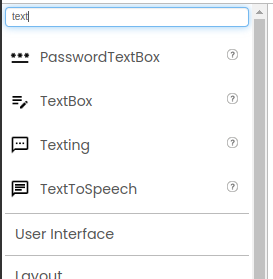
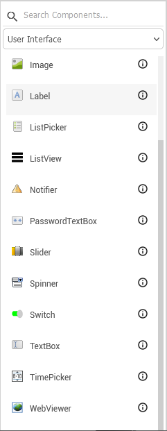
Conventionally, the current Stack Panel displays components under different categories, which requires users to scroll down the entire screen to select a category and then a component. This makes the user experience slightly cumbersome and, from my perspective, less visually appealing.
I propose an enhancement to the Components Stack Panel to improve its usability. In my fork, I have implemented a component box similar to the one used in Niotron, which I believe enhances the user experience. If you find this suggestion valuable, I would be happy to submit a pull request for this change.
Thank you for considering my suggestion.
Best regards
Horizon
See that's not only the issue, you are correct that opening a category should close another, but like the Category "User Interface" contains a lot of components as compared to the "Social" category, now User Interface category leads to scroll the whole body of all inventor which seems to be somewhat cumbersome, my main point is to make a new system which can solve this issue or should make a way like Kodular or Niotron which are better in this aspect
Actually I'm not concerned about this,
I'm concerned about the same issue that @vknow360 has posted too,
Which is basically closing of a previously opened category after opening another one
That's the point, now I'm thinking not to put pressure on my muscle memory and my brain to close the categories unless it should automatically do that for me
P.S:
You have to wait for a while because I'm not on my system right now, when I'll be there then I'll post it up for sure
I was talking about something similar to this, because it will reduce the while headache of scrolling and all in once,
Hope so its enough to explain what I want to say
FWIW, the categories staying open when you open a new one is a new feature in this release to address the problem of the User Interface category being large enough to push all the other categories below the fold. There was no way in the old system to close a category before opening another one, so users had to scroll before they could access anything other than User Interface, and new users might not appreciate how many other options there were. The ability to close the top category and see the others is long-requested feature.
In the current system, categories open and close independent of each other. But note that returning to the old system of a single category open at a time requires more scrolling rather than less.
Another possibility might be to sub-divide the User Interface category so that it is not so large. Straightforward UI components like buttons and labels really need to be what users see first, but more complex things like Notifier and WebViewer might do better under a different heading.
We're going to stick with this format for now and see how it goes.
I appreciate @Horizon's suggestion of making the category a drop-down list. We're keeping that in mind.
I also recommend using a Beginner or Intermediate Toolkit, which you can select from the new project dialog, to help make the components palette more navigable.
Thank you, Susan, for your detailed explanation. I understand the reasons behind the current setup and appreciate the efforts to improve usability. The idea of subdividing the User Interface category sounds promising to reduce the scrolling issue. I will also explore the Beginner or Intermediate Toolkit for better navigation.
If there's any way I can help further or provide more insights from my fork, please let me know. Thanks again for considering my suggestion about the drop-down list. Looking forward to seeing how this evolves.
That toolkit option to choose from at the beginning after creating a new project should be removed imho...
Every other day we get questions from users, who are looking for components, because they chose a beginner or intermediate toolkit without realizing the consequences
There's detailed help information on the selection. Perhaps we can make it more prominent.
What you don't see are the new users freaked out by the huge list of components that they don't understand who are scared off the platform. Those are not people who show up and post on the forum, but we deal with them in other settings.
My technically sophisticated 8yo (at the time) tried to do a series of tutorials, and she couldn't find the components on the palette.
I admit that I'm a bit perplexed as to why these people classified themselves as beginner in the first place, since they clearly already know about very sophisticated blocks. The default toolkit is Expert, so they had to consciously choose something else.
yes, those people consider themselves not as Expert and therefore chose another toolkit... they do not realize, that this results in getting only a reduced set of blocks
You might think about renaming "Expert" to "All blocks" or similar to avoid this misunderstanding...
This is a good suggestion. I think in an earlier draft, we used "Unrestricted" instead. I'm not sure if that's the right term either, but we can think on this.