Customize your textboxes with radius, borders and background gradients
Code Blocks and Description
- Constructor
TextboxCustom- Description: Initializes the non-visible component.
- Parameters:
ComponentContainer containercontainer: The container where theTextboxCustomcomponent will be placed.
- Function
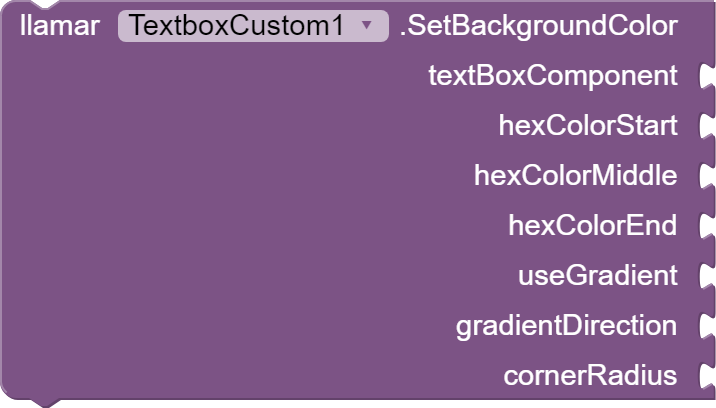
SetBackgroundColor- Description: Sets the background color of the TextBox, optionally with a gradient.
- Parameters:
TextBox textBoxComponent: The App Inventor TextBox component.String hexColorStart: The starting color of the gradient in hexadecimal.String hexColorEnd: The ending color of the gradient in hexadecimal.boolean useGradient: Whether to apply a gradient (true/false).int gradientDirection: The direction of the gradient (0 to 7, see documentation for details).
- Function
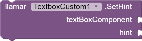
SetHint- Description: Sets a placeholder text for the TextBox.
- Parameters:
TextBox textBoxComponent: The App Inventor TextBox component.String hint: The placeholder text to display when the TextBox is empty.
- Event
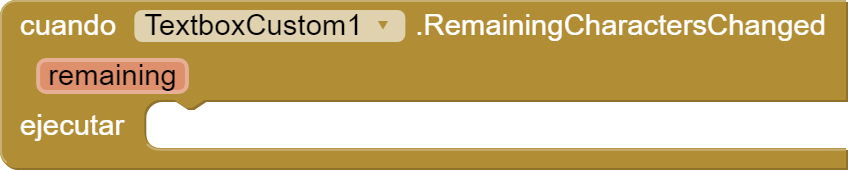
RemainingCharactersChanged- Description: Triggered when the number of remaining characters changes.
- Parameters:
int remaining: The number of remaining characters.
- Function
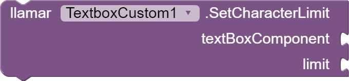
SetCharacterLimit- Description: Sets a character limit for the TextBox and triggers the
RemainingCharactersChangedevent when characters are typed. - Parameters:
TextBox textBoxComponent: The App Inventor TextBox component.int limit: The maximum number of characters allowed in the TextBox.
- Description: Sets a character limit for the TextBox and triggers the

- Function
SetBorder- Description: Sets the border color, width, and corner radii of the TextBox, optionally with a background color.
- Parameters:
TextBox textBoxComponent: The App Inventor TextBox component.String borderColor: The border color in hexadecimal format.int borderWidth: The border width in pixels.float topLeftRadius: The radius of the top left corner in pixels.float topRightRadius: The radius of the top right corner in pixels.float bottomLeftRadius: The radius of the bottom left corner in pixels.float bottomRightRadius: The radius of the bottom right corner in pixels.boolean hasBackgroundColor: Whether to apply a background color (true/false).String backgroundColor: The background color in hexadecimal format.boolean hasBorder: Whether to apply a border (true/false).
- Function
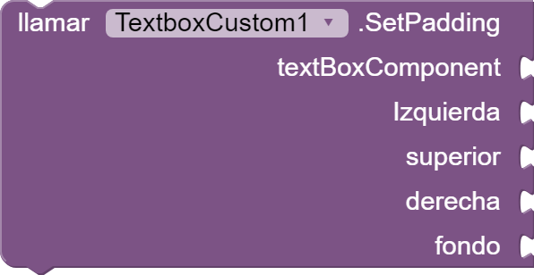
SetPadding- Description: Sets the padding inside the TextBox.
- Parameters:
TextBox textBoxComponent: The App Inventor TextBox component.int left: The padding on the left side in pixels.int top: The padding on the top side in pixels.int right: The padding on the right side in pixels.int bottom: The padding on the bottom side in pixels.
- Function
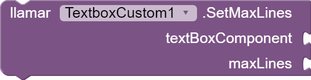
SetMaxLines- Description: Sets the maximum number of visible lines in the TextBox.
- Parameters:
TextBox textBoxComponent: The App Inventor TextBox component.int maxLines: The maximum number of lines that can be displayed simultaneously.

- Function
SetSingleLine- Description: Sets whether the TextBox should be single-line or not.
- Parameters:
TextBox textBoxComponent: The App Inventor TextBox component.boolean singleLine:trueif the TextBox should be single-line,falseotherwise.
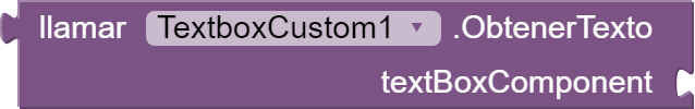
- GetText
- Description: Retrieves the current text content of the TextBox.
- Parameters:
TextBox textBoxComponent: The App Inventor TextBox component from which to get the text.

- SetFirstLetterCapitalized
- Description: Automatically capitalizes the first letter of input text.
- Parameters:
TextBox textBoxComponent: The App Inventor TextBox component to modify.
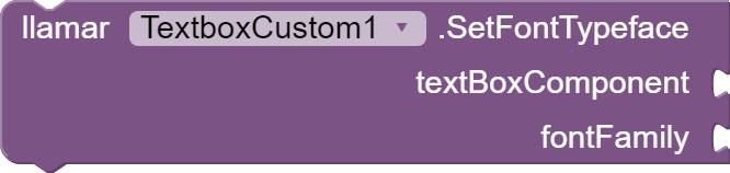
- SetFontTypeface
- Description: Sets the typeface (font) for the text displayed in the TextBox.
- Parameters:
TextBox textBoxComponent: The App Inventor TextBox component to apply the font to.String typeface: The name or path of the font to use.
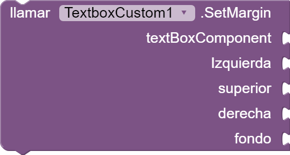
- SetMargin
- Description: Sets the outer margins for the TextBox.
- Parameters:
TextBox textBoxComponent: The App Inventor TextBox component to apply margins to.int left: The left margin in pixels.int top: The top margin in pixels.int right: The right margin in pixels.int bottom: The bottom margin in pixels.
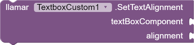
- SetTextAlignment
- Description: Sets the horizontal alignment of text within the TextBox.
- Parameters:
TextBox textBoxComponent: The App Inventor TextBox component to align text within.int alignment: The alignment value (e.g.,0for left,1for center,2for right).
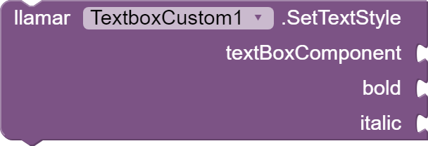
- SetTextStyle
- Description: Sets the style (e.g., bold, italic) of the text in the TextBox.
- Parameters:
TextBox textBoxComponent: The App Inventor TextBox component to apply text style to.int textStyle: The style value (e.g.,0for normal,1for bold,2for italic).
-
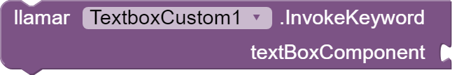
InvokeKeyword-
Description: This function is used to trigger the keyword event on a TextBox component, which in turn opens the virtual keyboard on the device.
-
Parameters:
textBoxComponent: The TextBox component on which the keyword event will be invoked and the keyboard will be opened.
-

Video example:
aia project:
TextboxCustomTest.aia (25.2 KB)
Extension:
TextboxCustom.aix (23.3 KB)
Thanks.