 Introduction
A non-visible extension that provides additional features to the built-in Notifier component.
Package name: com.gordonlu.daffydialog
Version: 8
Release date: 2022-03-25T12:30:00Z
 Documentation
Event blocks
CustomChooseDialogCanceled
This event is fired when the user has pressed the cancel button in a custom choose dialog.
Parameters: id = number (int)
CustomDialogDismissed
This event is invoked when the custom dialog you created was dismissed.
CustomMessageDialogClosed
This event is fired when the user has pressed the dismiss button in a custom message dialog.
Parameters: id = number (int)
Error
This event is invoked when an error has occurred.
Parameters: error = text, block = text
GotCustomChooseDialog
This event is fired when the user has pressed button1 or button2 in a custom choose dialog.
Parameters: id = number (int), choice = text
GotNumberPickerDialog
This event is fired when the user has pressed the OK button in a number picker dialog.
Parameters: id = numbr (int), number = number (int)
GotPasswordInputDialog
This event is fired when the user has pressed the OK button in a password input dialog.
Parameters: id = number (int), password = text
GotTextInputDialog
This event is fired when the user has pressed the OK button in a text input dialog.
Parameters: id = number (int), input = text
ImageDialogClosed
This event is fired when the user has pressed the dismiss button in an image dialog.
Parameters: id = number (int)
LinearProgressDismissed
This event is invoked when the linear progress dialog was dismissed.
NumberPickerDialogCanceled
This event is fired when the user has pressed the cancel button in a number picker dialog.
Parameters: id = number (int)
PasswordInputDialogCanceled
This event is fired when the user has pressed the cancel button in a password input dialog.
Parameters: id = number (int)
TextInputDialogCanceled
This event is fired when the user has pressed the cancel button in a text input dialog.
Parameters: id = number (int)
Method blocks
CreateCustomDialog
Show whatever you want in a dialog. You can use as example arrangements, or images or whatever you want. Your chosen layout will be then removed from the screen and only visible in custom dialog. Please make sure the layout you want to use is visible.
Parameters: component = component
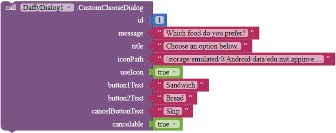
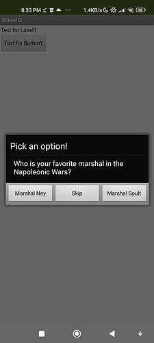
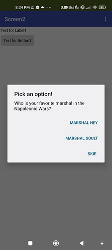
CustomChooseDialog
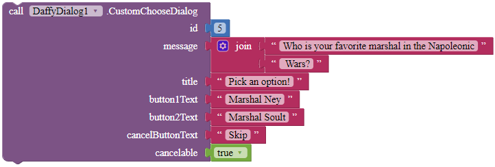
Shows a custom choose dialog. The id parameter is an ID to specify the notifier, in case you want to show two dialogs with the same extension. The title and message parameter are for specifying the title and message of this dialog respectively. When the user has tapped button1 or button2 in this dialog, the extension fires the GotCustomChooseDialog event. If it is canceled, the extension will call the CustomChooseDialogCanceled event.
Parameters: id = number (int), message = text, title = text, iconPath = text, useIcon = boolean, button1Text = text, button2Text = text, cancelButtonText = text, cancelable = boolean
CustomMessageDialog
Displays a custom message dialog.
Parameters: id = number (int), title = text, message = text, iconPath = text, useIcon = boolean, buttonText = text
DismissCustomDialog
Dismisses the custom dialog that you have shown.
DismissLinearProgressDialog
Dismisses the linear progress dialog that you have shown.
ShowCustomDialog
Shows the custom dialog that you have created.
ShowImageDialog
Displays an image in a dialog. This requires an absolute path pointing to the image location. All supported file types are PNG, JPEG and JPG. After the user has pressed the button, the extension will fire the ImageDialogClosed event.
Parameters: id = number (int), title = text, message = text, imagePath = text, buttonText = text, iconPath = text, useIcon = boolean
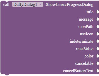
ShowLinearProgressDialog
Shows a progress dialog with a horizontal progress bar. Can be dismissed by user if "cancelable" is set to true. If indeterminate is set to true, maxValue and the "UpdateProgress" block will have no effect.
Parameters: title = text, message = text, iconPath = text, useIcon = boolean, indeterminate = boolean, maxValue = number (int), color = color, cancelable = boolean, buttonText
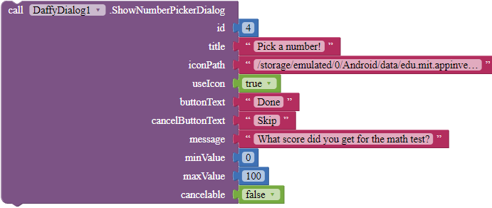
ShowNumberPickerDialog
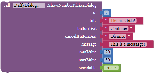
Displays a number picker dialog that enables the user to select a number from a predefined range.
Parameters: id = number (int), title = text, iconPath = text, useIcon = boolean, buttonText = text, cancelButtonText = text, message = text, minValue = number (int), maxValue = number (int), cancelable = boolean
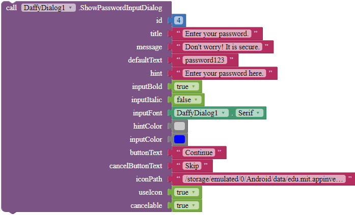
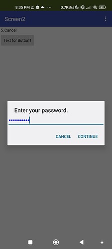
ShowPasswordInputDialog
Shows a password input dialog. The id parameter is an ID to specify the notifier, in case you want to show two dialogs with the same extension. The title parameter is for specifying the title of this dialog. defaultText is the default text for the input in which the user will first see in the textbox when they open the dialog, and hint is the hint of that textbox. Use inputBold, inputItalic, hintColor and inputColor to customize the textbpx, and use the property blocks to specify inputFont. buttonText is the text of the OK button, while cancelButtonText is the text of the cancel button.
Parameters: id = number (int), title = text, message = text, defaultText = text, hint = text, inputBold = boolean, inputItalic = boolean, inputFont = text, hintColor = color, inputColor = color, buttonText = text, cancelButtonText = text, useIcon = boolean, cancelable = boolean
ShowTextInputDialog
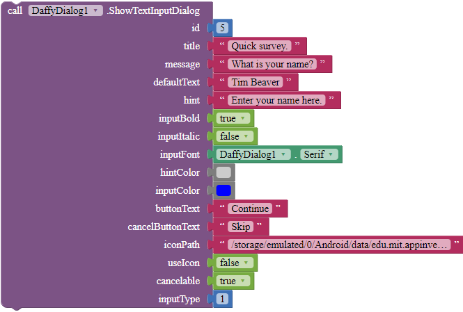
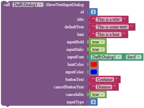
Shows a text input dialog. The id parameter is an ID to specify the notifier, in case you want to show two dialogs with the same extension. The title parameter is for specifying the title of this dialog. defaultText is the default text for the input in which the user will first see in the textbox when they open the dialog, and hint is the hint of that textbox. Use inputBold, inputItalic, hintColor and inputColor to customize the textbpx, and use the property blocks to specify inputFont. buttonText is the text of the OK button, while cancelButtonText is the text of the cancel button.
Parameters: id = number (int), title = text, message = text, defaultText = text, hint = text, inputBold = boolean, inputItalic = boolean, inputFont = text, hintColor = color, inputColor = color, buttonText = text, cancelButtonText = text, cancelable = boolean, inputType = number, iconPath = text, useIcon = boolean, cancelable = boolean
For what to fill in in the inputType parameter, here are some examples.
plain old normal text - 1.
number - 2.
phone number - 3.
date/time - 4.
email address - 32.
For more, see the Android Developers documentation: InputType | Android Developers
UpdateProgress
Updates the progress of the linear progress dialog. Has no effect if it is indeterminate.
Parameters: progress = number (int)
Property blocks
DimAmount (designer, blocks, read, write)
Sets the amount of dim behind the dialog window. 0.0 stands for no dim and 1.0 stands for full dim.
Accepts: number (float)
Fullscreen (designer, blocks, read, write)
This property specifies whether fullscreen should be enabled for the dialog.
Accepts: boolean
HTMLFormat (designer, blocks, read, write)
This property specifies whether HTML format should be enabled for the messages and titles of all dialogs in this extension.
Accepts: boolean
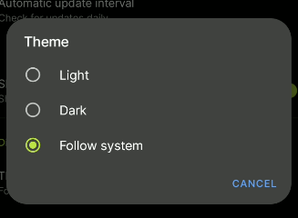
LightTheme (designer, blocks, read, write)
This property specifies whether light theme should be enabled for the dialog.
Accepts: boolean
Plus, 4 property blocks for fonts: DefaultFont, SansSerif, Serif and Monospace.
 Downloads
AIX:
com.gordonlu.daffydialog.aix (36.2 KB)
 Open Source
 License
This extension is licensed under Creative Commons Attribution-ShareAlike 3.0 Unported (CC BY-SA 3.0).
![]() Remix and redistribute the extension or its source code however you like, for private, public, education and commercial use.
Remix and redistribute the extension or its source code however you like, for private, public, education and commercial use.
![]() Mention the author explicitly, and provide a link to this topic.
Mention the author explicitly, and provide a link to this topic.
Regards,
Gordon


